Gracious Sisters
INTRODUCTION
Violence against women (VAW) is a significant widespread public health problem and social issue in the United Kingdom. Violence against women refers to gender related violence that normally results in the physical, sexual, mental harm to a woman.
The focus of this proposed computing research project is to tackle this very important question: “How can we continue to use technology as aid in combatting violence against women?”
PROJECT
GRACIOUS SISTERS
- Role - UX Designer
- Tools - Axure, Sketch, Marvel, InVision,
- Team - Catherine Achieng,
- Timeline - 4 Months
- Key Deliverables - Domain research, Competitive analysis, Subject Matter Expert (SME) Interviews, Affinity diagramming, User personas, User journey maps, Information Architecture, Paper prototyping, Concept testing, Usability testing, Mid-fidelity wireframes, App Map, inVision prototype, Annotated wireframes
USING TECHNOLOGY TO END VAW
There has been an increase in recognition of the need to understand how technology can be used to end violence against women. Professional service providers who work with victims of VAW use innovative technologies to accomplish different work tasks. From communicating with peers to seeking relevant information on the web (Murray et al, 2015). In addition to using technology for mundane tasks related to the VAW safety and interventions, VAW professionals also use technology to actively communicate their messages to the community. Service providers find technology to be very useful as it allows them to offer support and protection to victims via emails, video calls and monitoring systems (Murray et al, 2015).
Despite all ofthese advantages, the technology advancements pose a massive safety risk to victims of VAW. Perpetrators have been using technology to harass their victims through the use of phone calls, emails and text messaging.
EMPATHISE
RESEARCH & FINDINGS
The main aim of the research was to shed light on the experiences faced by the victims of VAW and how we can continue to use technology as an aid in combatting this major social phenomenon. The qualitative research methodology was employed to collect the non- numerical data for this project. Gathering this information was very important for the study because victims from different religions and cultural backgrounds normally have very different experiences with VAW .
Participants Data
SYNTHESIS
WHO IS THE USER?
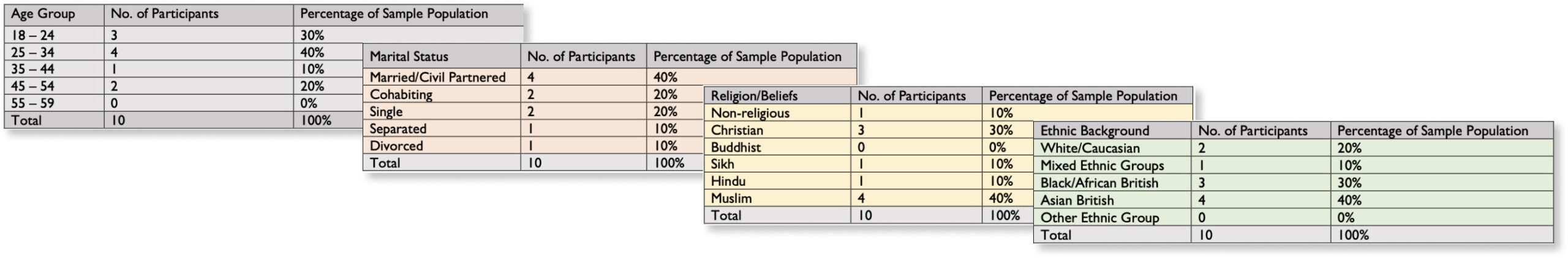
The study findings gave an insight on the victims and survivors of VAW demographics, the issues they face when seeking support and what their thoughts are on the ideal help-seeking UX.
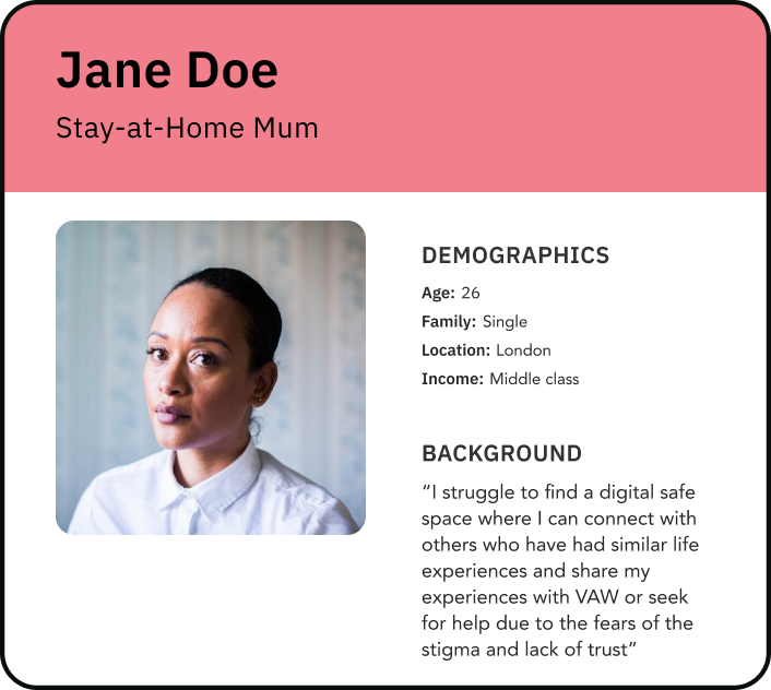
Using the results gathered from the participants and without disclosing any personal information, the following user persona was created.
The user persona shown below is of a fictional character that represents all of the different women who participated in the study.
User Persona, Jane Doe
PROBLEM STATEMENT
In order to stay focused and fulfil the needs and wants of the user (Jane Doe), the main issue needed to be properly communicated and understood. A brief yet clear description of the problems that needed to be solved in order to improve the UX of accessing VAW support. Below is a problem statement that is framed from the user research point of view and it is based on the 4 Ws (Who, What, Where & Why).
Problem Statement
IDEATING
PAPER SKETCHING
Once the concepts were defined, the next step was to bring them to life. The 6-8-5 sketching method was employed in the ideation process. This method of sketching was advantageous because it allowed the designer to generate as many ideas as possible without worrying about the details of the final development or implementation of the Gracious Sisters App.
6-8-5 Sketches
BRAND
COLOUR PALETTE
The main theme colour of the Gracious Sisters app is pink. The main reason this colour was chosen is because Pink is a feminine colour and this was suitable for the product (Gracious Sister app) because the users are female. Pink colour is also associated with softness, kindness, nurturance and compassion all which are the appropriate qualities for support givers who deal with sensitive topics such as VAW.
Colour Palette
LOGO DESIGN
The logo design for Gracious Sisters comprises of circles and hands that form a circle of hands. The circle of hands signify the unity, love and support that the victims and survivors of VAW would receive on the platform.
Colour Palette
STYLE TILE
To further define the visual style of the concepts that were to be incorporated, a style tile was created. The style tile was helpful in achieving and maintaining consistency and unity with the overall design of the Gracious Sisters app.
The image below, is the Gracious Sisters style tile that consists of the colours and interface elements that communicate the visual brand for Gracious Sisters.
Style Tile
CONCEPTS
APP MAP
An application map was created to strategise and visualise the architecture and hierarchy of the concepts on the Gracious Sisters app.
App Map
PROTOTYPE
LOW FIDELITY AND HIGH FIDELITY WIREFRAMES
To further define the visual style of the concepts that were to be incorporated, a style tile was created. The style tile was helpful in achieving and maintaining consistency and unity with the overall design of the Gracious Sisters app.
The image below, is the Gracious Sisters style tile that consists of the colours and interface elements that communicate the visual brand for Gracious Sisters.
Low Fidelity and High Fidelity Wireframes
APP USER FLOWS
The path or journey taken Gracious Sisters app by Jane Doe to complete a task or access from the entry is demonstrated in the following user flows.
App User Flows