Welcome to my UX Design Portfolio. I am a London-based UX designer with a background in Computing. I also mentor fellow designers and I love to speak about design.
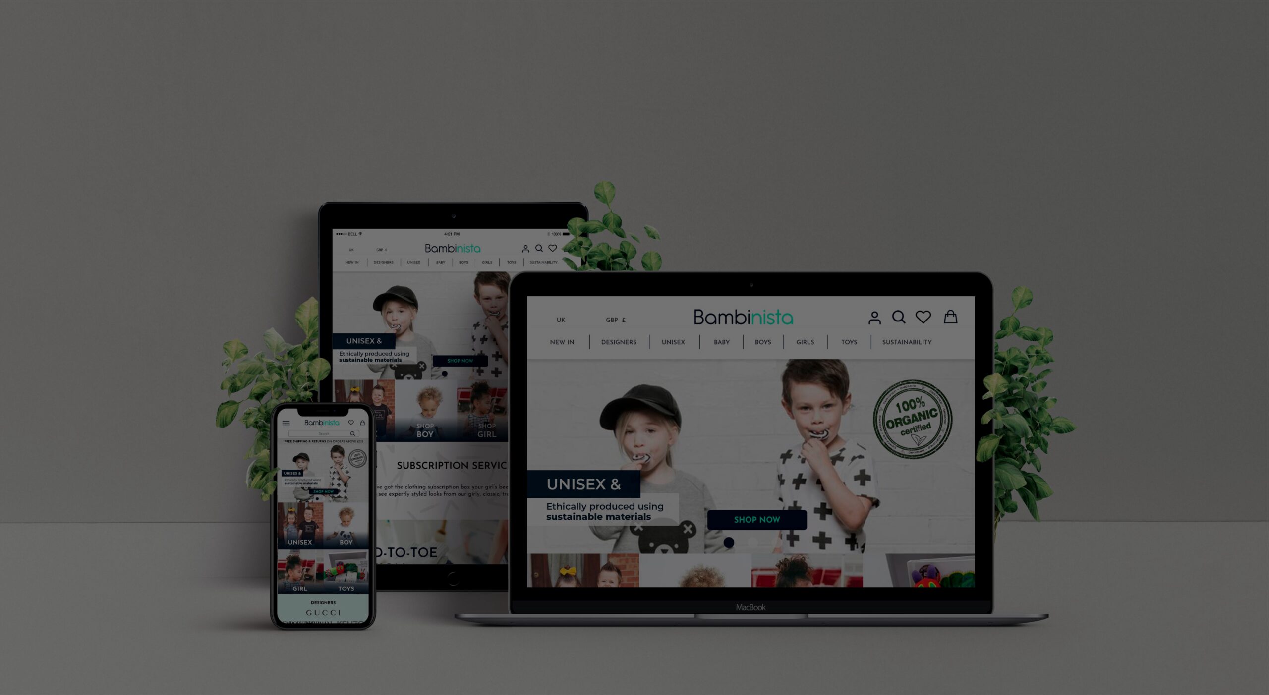
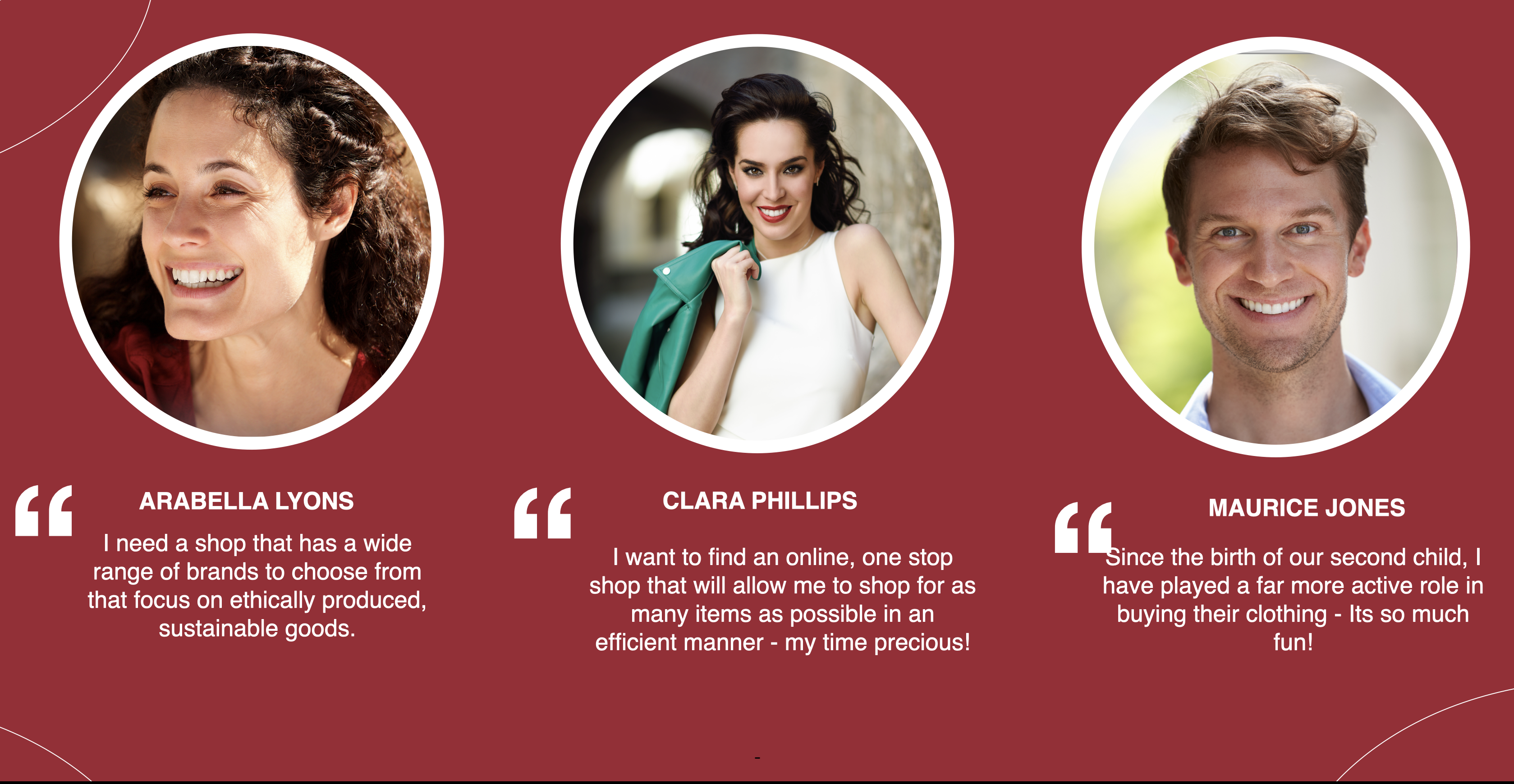
Bambinista is an online marketplace for kids fashion, decor, homewares and toys, selling brands sourced mainly from the UK and Europe, and delivering anywhere in the world. Founded by a former fashion buyer and current mother, Bambinista strives to be the go-to internet boutique for trendy and sustainable items for little fashionistas. Bambinista’s target market is parents aged 20-45, with young children of 1 to 6 years, predominantly female and fairly affluent. These are moms willing to spend a little bit more for quality, but who also care about practicality. Moms who drink a glass of wine at the end of the day and who appreciate a brand with a bit of cheekiness.
PROJECT
BAMBINISTA WEBSITE RE-DESIGN SOLUTION
Role - UX/UI Designer
Tools - Sketch, Marvel, InVision,
Timeline - 4 Weeks
Key Deliverables - Domain research, Competitive analysis, User personas, User journey maps, Information Architecture, Paper prototyping, Concept testing, Usability testing, Mid-fidelity wireframes, App Map, inVision prototype
THE CHALLENGE
Operational for just over a year, the current Bambinista site is built on a Shopify backend, utilising a standard theme. While the current look and feel is clean and professional enough, there was a feeling that it didn’t truly express Bambinista’s aspirational personality.
Our original goals for this project were to re-style the website layout and logo as well as creating new features and concepts that will improve the website User Experience.
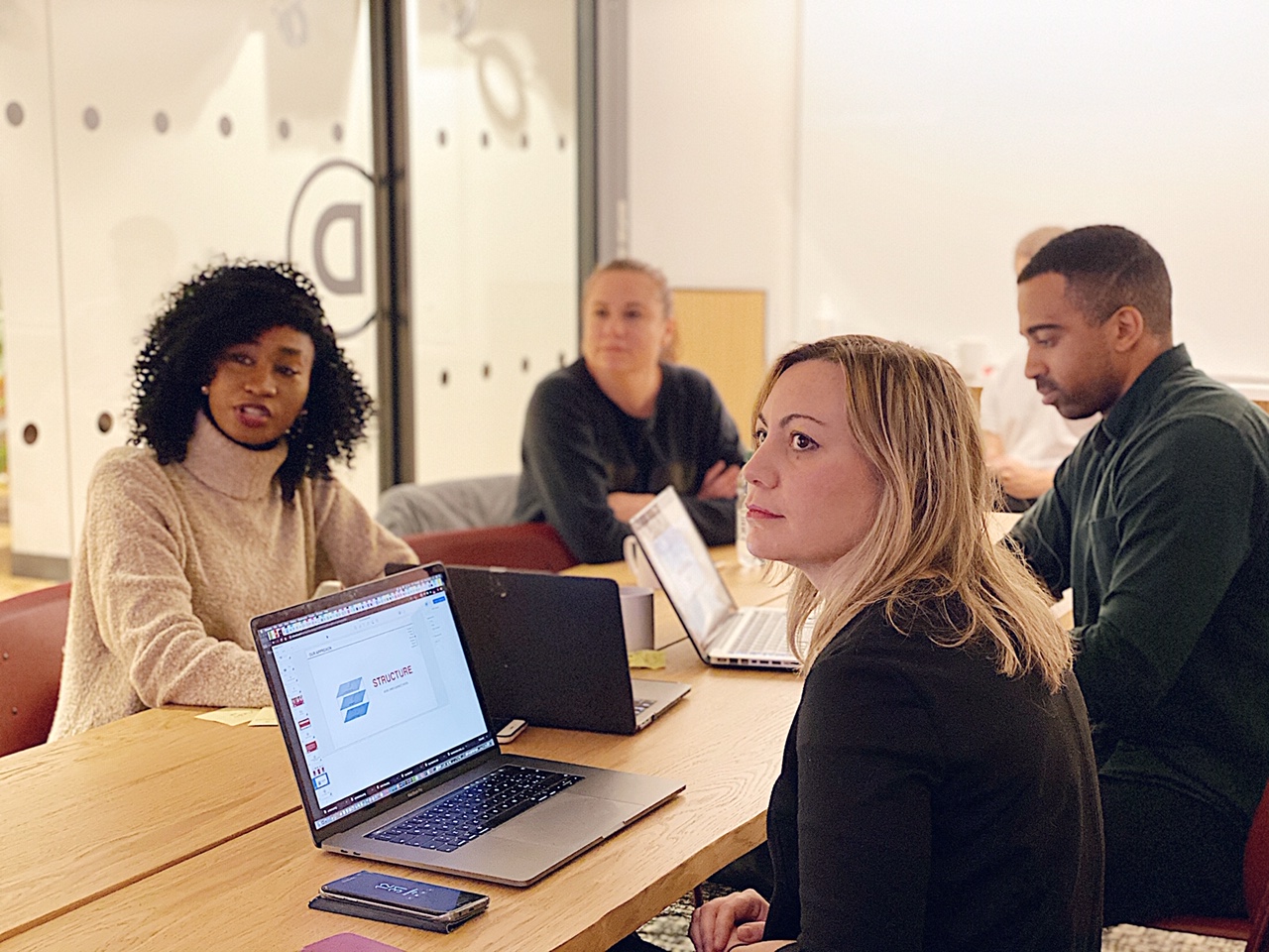
KICK-OFF MEETING WITH THE CLIENT
We had an informal meeting with Susan who is the founder of Bambinista. We asked various questions that would allow us to know what the long term goals are, the vision, mission etc. The main goal of this meeting was to acquire as much information from her as we possibly could so that we could head in the right direction. Some of the major topics that we covered include.
Brand values
History of the company
The challenges faced by the company
What would define success.
APPROACH
THE APPROACH THAT WE FOLLOWED
To complete the project we followed the Jesse James Garrett’s method knows as the Elements of User Experience. This method allowed us to cut through the complexity of user-centred design. We decided to use this method as gave us the big picture of the user experience development, from strategy and requirements to information architecture and visual design.
1. Strategy
2. Scope
3. Structure
4. Skeleton
5. Surface
STRATEGY
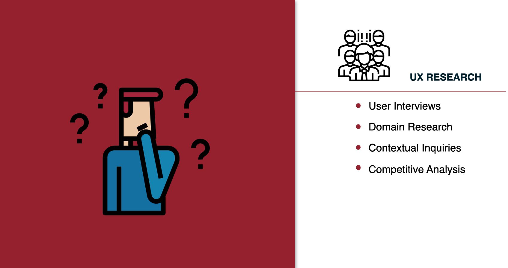
TYPES OF RESEARCH METHODS WE PERFORMED
This is where it all started, We needed to figure out what we wanted to get out of the site, what the users needs are and how we could best implement the project. To do so, we performed various types of research. The methods used are listed in the image below;
The methods of research that we conducted.
SCOPE
WHAT DID WE FIND?
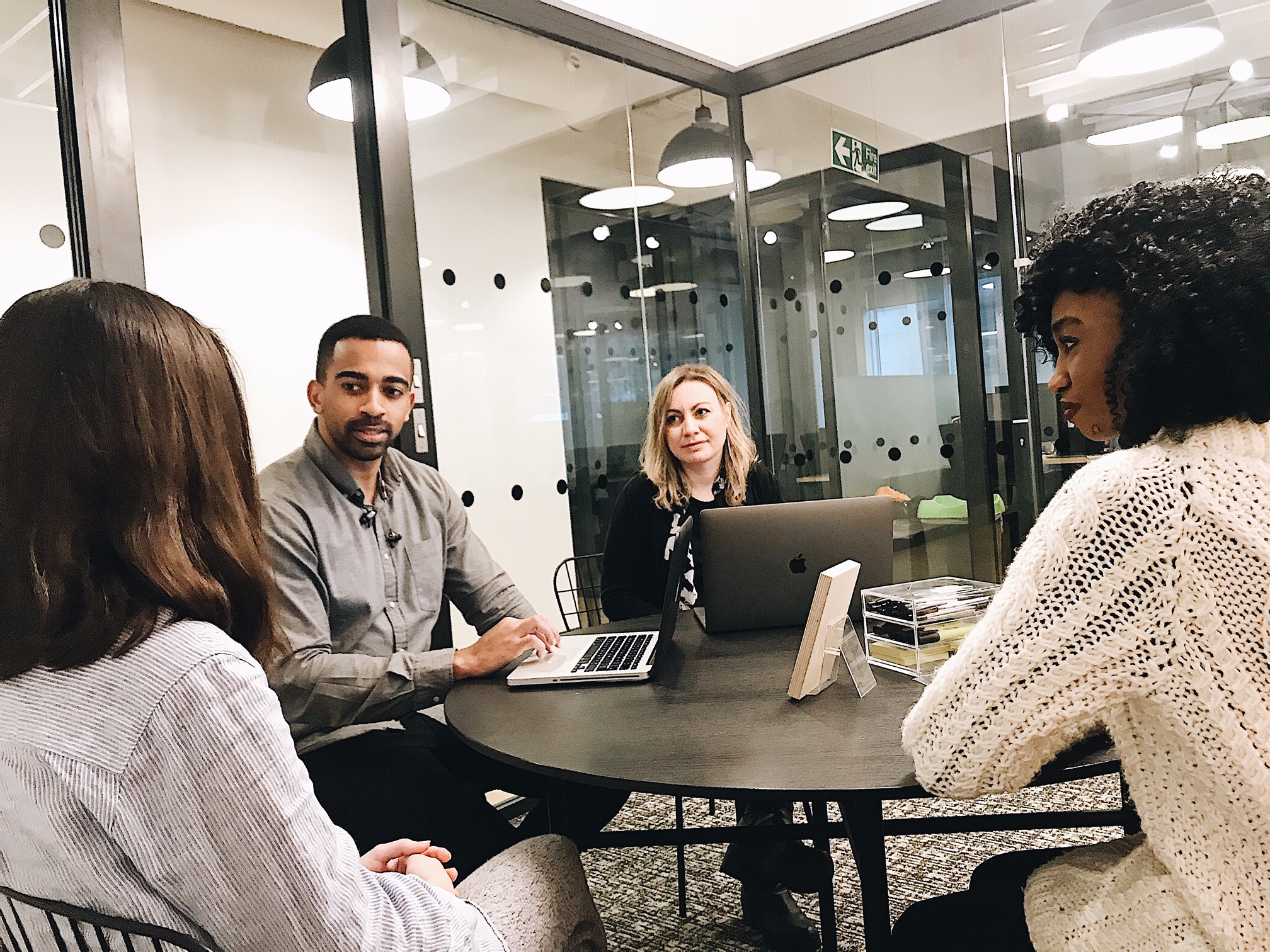
We also conducted contextual inquiry on the user. We asked the participants to go on the Bambinista website and try to purchase goods. They were also asked to ‘think-out-loud and the following are the results of this research.
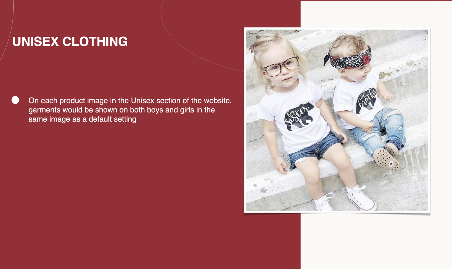
63%
of the people said the provision of unisex clothing is becoming increasingly important to the modern day parent.
73%
of parents care about goods being produced in an ethical manner using sustainable materials
76%
of parents prefer to buy entire outfits over purchasing individual pieces. Mainly to take advantage of free delivery.
What did the users think of Bambinista website?
CONTEXTUAL INQUIRY
We also conducted contextual inquiry on the user. We asked the participants to go on the Bambinista website and try to purchase goods. They were also asked to ‘think-out-loud and the following are the results of this research.
The presentation of the Bambinista brand values could be stronger on the current website.
Images used throughout the website do not reflect the high quality of the products being sold
Navigating through the site can be confusing at times and should be simplified in order to make the browsing experience more enjoyable.
The logo could be changed/refined in order to better communicate the Bambinista brand values.
Who did we focus on?
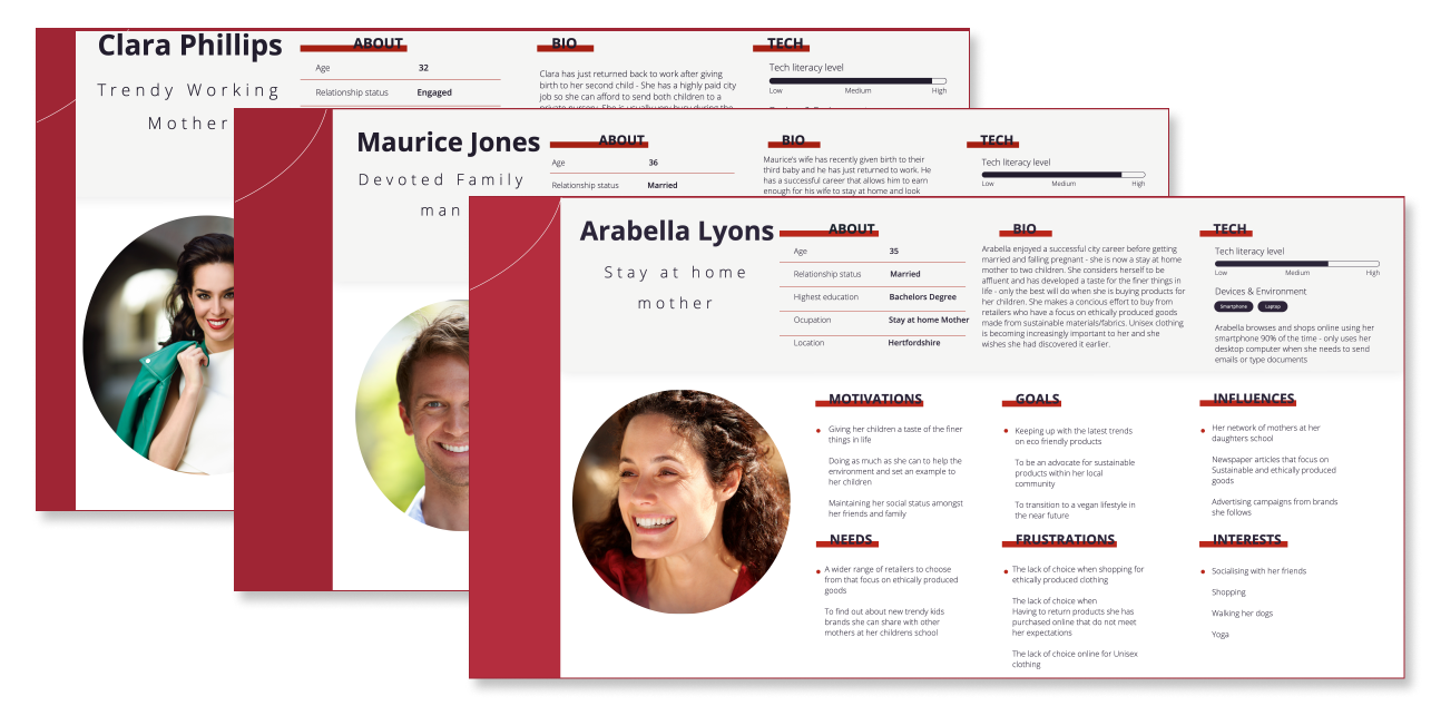
USER PERSONAS
Once we synthesised the results that we acquired from the results, We were able to define three personas, two mums and a dad. These three personas shared a similar motivation but they all have different career backgrounds and expectations when it comes to shopping for their children.
User Persona’s
User Persona’s
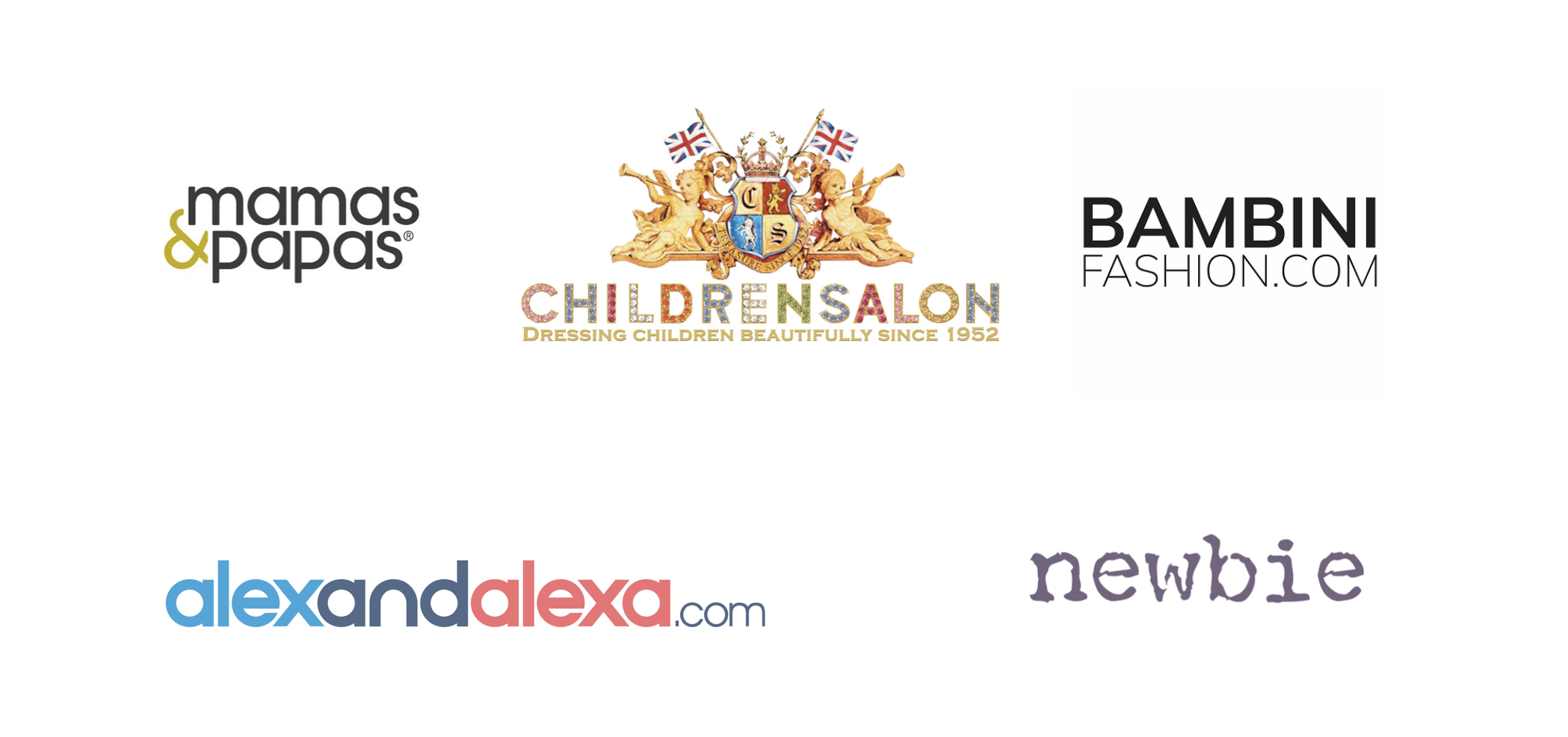
COMPETITORS VISUALS
We also explored the domain by conducting a visual competitive analysis on other websites that sell similar products to the Bambinista website. Through this research we found out that these luxury brand websites had a very minimalistic design. This made the photos inviting by standing out a lot more in a bold way.
Direct & Indirect Competitors
What is the vision?
VISION STATEMENT
After combining our understanding of Susan’s goals and frustrations that the users face, we determined the opportunity and problem that the Bambinista website needed to solve for. We synthesised our research results and formulated the products vision statement. We used this as a guide during the brainstorming and concepting phases.
The Bambinista Website is for busy, affluent, modern-day mums who need a way to quickly and easily shop for high-quality children’s products because they care about their wellbeing and don’t have the time to shop with multiple retailers.
Bambinista should stand out from its competitors because all of its brands are eco-friendly & sustainable and have been manufactured in an ethical and non-exploitative way.
STRUCTURE
WHAT DID WE CONSIDER IMPORTANT FOR OUR DESIGNS?
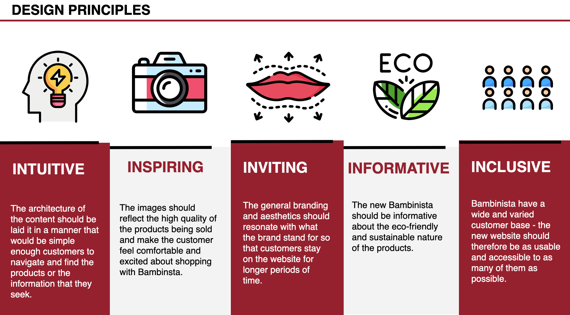
To create potential visual directions, we focused on the main needs of the Bambinista website users and we were able to come up with the following five design principles. Meet the DNA of our project.
Design Principles
What did the users of Bambinista need?
CONCEPTS
Once we had a solid foundation of potential product requirements and an understanding of the wants, needs and goals of both the users and Susan, we dove into concept brainstorming.
Concept Cards
SKETCHING
Using the 6-8-5 sketching method, we individually drew out our ideas. These sketches gave us a better experience and perspective on the benefits of differing levels of fidelity and how they relate to the goals of the product. After several rounds of ideation and feedback, we refined the a few selected concepts and sketched wireframes.
Wireframe Sketching
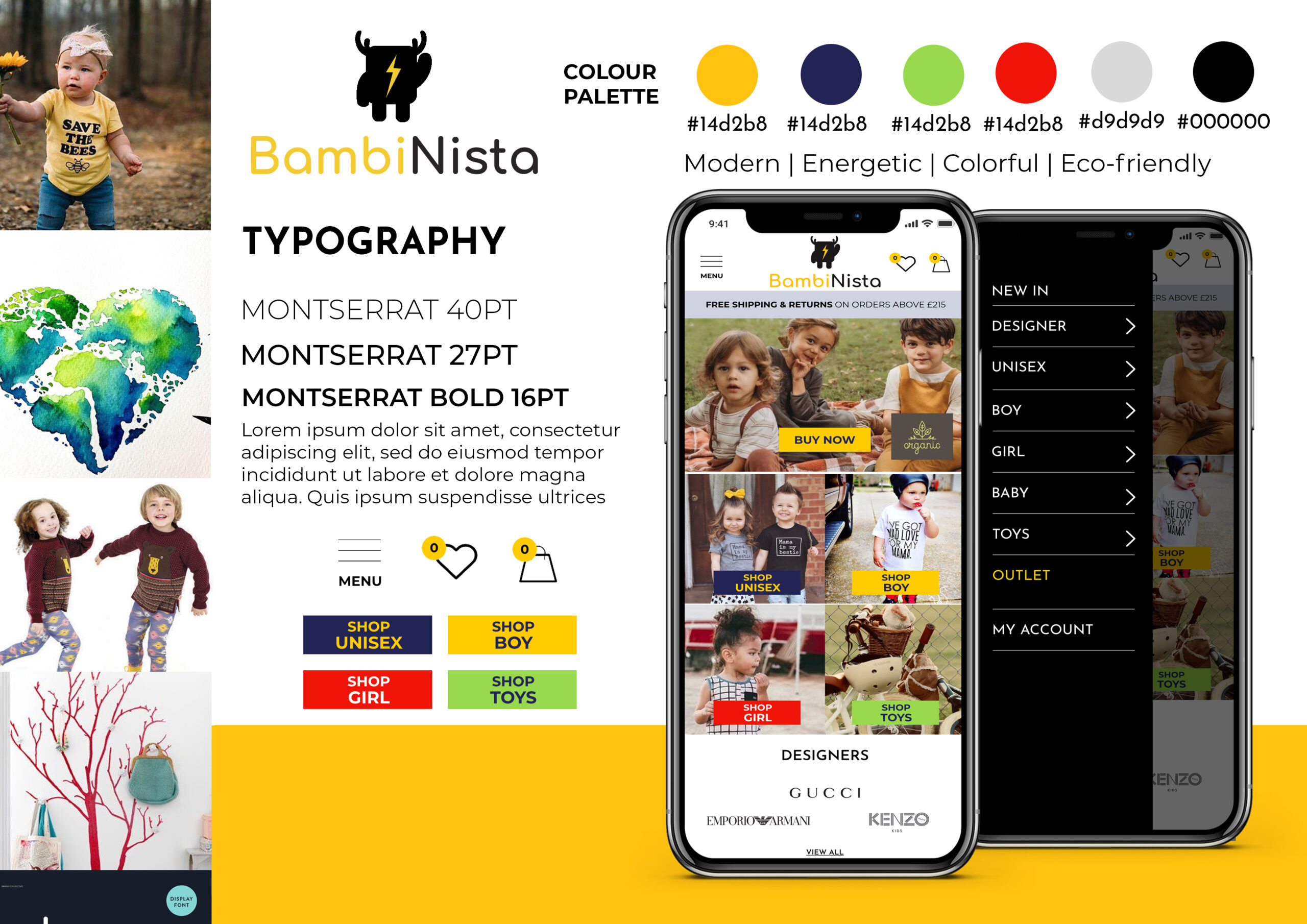
EXPLORING VISUAL DIRECTIONS
Using the results from our research, we were able to create a few style guides and mood boards. We then conducted a user testing where we asked people to tell us what they thought of the designs and if they are appropriate for a children’s boutique.
Moodboard 2.
Moodboard 3
Logo Sketches
Logo Concepts
Refining the visuals
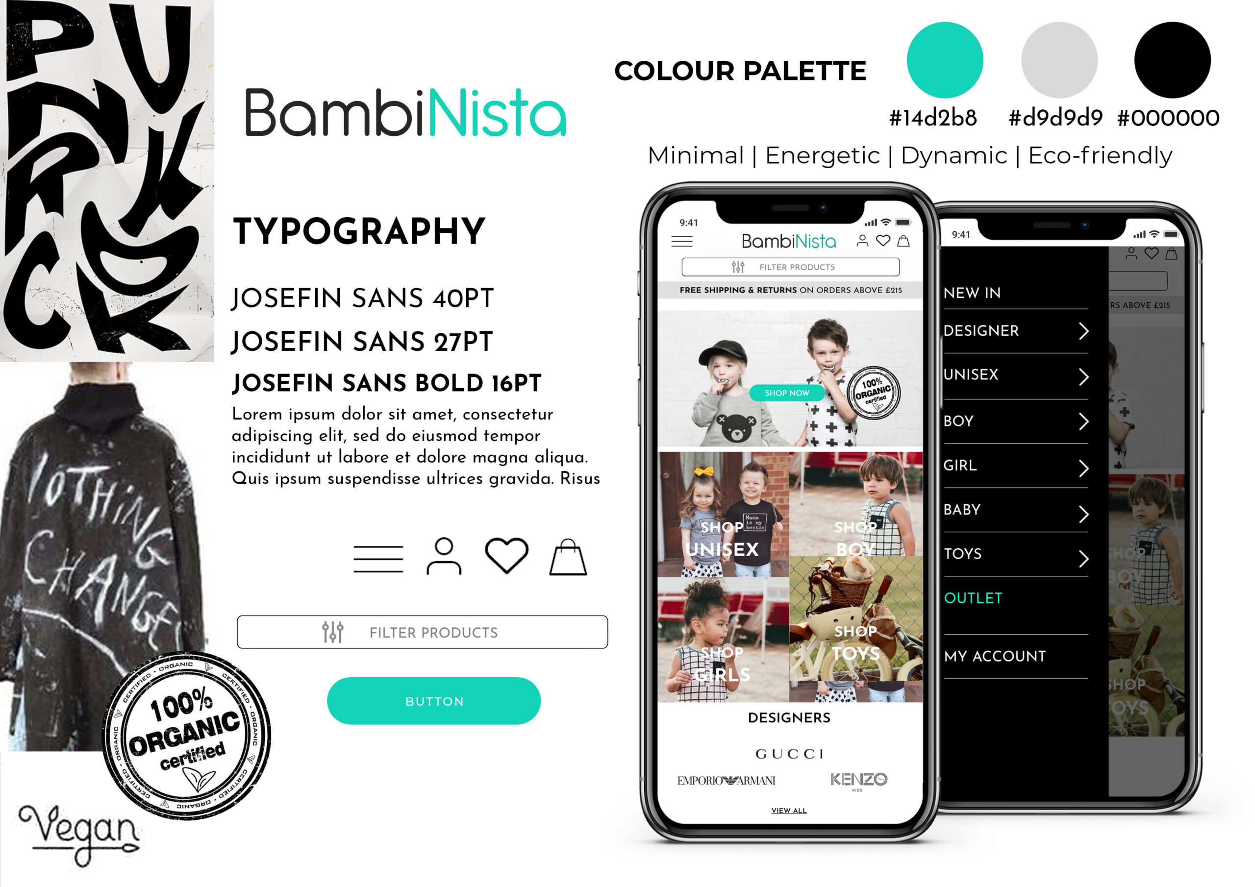
THE FINAL DESIGNS
User feedback suggested that we go for a more modern and elegant visual direction when building our product. The users picked the following Moodboard and Style Guide;
Final Moodboard
Final Style Guide
SKELETON
WIREFRAMES
Creating mid-fidelity wireframes allowed us to how different features of the new Bambinista website would fit together. It was very exciting to see the logical arrangements of how different screens and areas of the website relate.
Wireframes
HIGH-FIDELITY SCREENS
We created and iterated high-fidelity screens and then conducted a peer user testing. Using the feedback we refined the white space, reduced the number of text boxes on the forms, decreased the gradient usage and clarified the typography hierarchy. These changes improved alignment and created a more elegant look and feel.
High-Fidelity Screens
Before & After
PROTOTYPE TESTING
We tested a High-Fidelity prototype of our Concept Bambinista website – The prototype was built using Invision and the Tests were conducted both in-person and remotely. The remote test was conducted with Zoom and the user accessed the prototype through their browser.
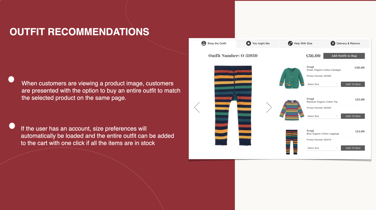
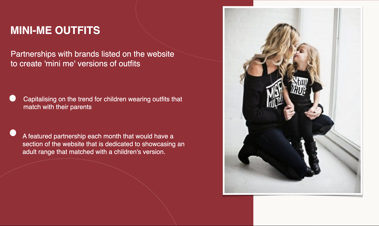
The Prototype test covered our proposed concepts and their specific flows/areas within the website: Filtering products by height, Engaging with the subscription service, Product recommendations based on user preferences, Outfit suggestions based on item selection, Bambinista ‘Mini Me’ concept, Ethics and Sustainability information.
“Putting together outfits is normally
very time consuming for me “
4.5 / 5
SUBSCRIPTIONS
“This would be far more useful for me than recommendations based on my buying history”
4.5 / 5
FILTER BY HEIGHT
“I really like the filter by height option as my son is much larger than the average two year old”
5 / 5
RECOMMENDATIONS
PROTOTYPE
Click play on the video to watch the prototype walkthrough.
Conduct further product testing with a larger sample size in order to achieve statistical significance
Begin work on building wireframes for a newly designed custom website
Conduct further research with more participants to help with the creation of new features and concepts.
FINAL PROJECT HANDOFF
Despite all of the good feedback that we received from the user testing results, we were still a bit nervous to present the final project to the client. This is because she hadn’t seen a large chunk of the designs/deliverables. Luckily, she loved the work we had done for her and wanted us to carry on with the project by implementing the design on to her website. She is now using the new logo that we created for her at her new store at Westfield shopping center.
New Logo – Bambinista Flagship Store
KEY TAKEAWAYS
Small things matter – By changing the newsletter subscription popup’s position of adding a ‘secure checkout’ label don’t seem like big innovations, but the made user frustrations disappear. If uncertain, A/B testing can help in deciding such questions.
Prioritising experience – We found that it is very important to prioritise the user experience over features/concepts. Some of the features sounded brilliant at first and were even highly ranked during concept testing but we later found out that the users found these confusing during prototype testing.
Importance of collaboration – We faced several issues during the implementation of the project. We had to fix some of the issues by ourselves but this caused a strain in the team at time. In the end the project was a success due to the collaborative effort.